Simpler Start.
Better Experience.
ThinkTrader is a powerful platform but new users face one key issue
Difficult first steps. The interface feels overwhelming and doesn’t provide clear direction.
This case study focuses on making the first-time experience simpler and helping users enter the platform with more confidence.

The Problem
The user reviews reveal a clear pattern. ThinkTrader feels more like a professional trading setup than a beginner-friendly platform, which makes new traders feel overwhelmed from the very first screen.
A quick heuristic evaluation confirmed these issues. The interface shows too many advanced tools at once, the starting point is unclear and essential guidance is missing at the moments users need it most. The dense hierarchy increases cognitive load and makes the first steps difficult for beginners.
These findings highlight what new users really need: a clearer structure, fewer distractions and simple guidance that helps them take their first confident action inside the app.


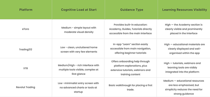
Competitive Analysis
I reviewed publicly available product information, app previews and UI behaviour, and explored the apps myself where possible. I combined these observations with trusted online sources to understand how each platform supports beginners during their first moments in the app.
Design Goals
The goal of the redesign was to improve the way new users experience their very first moments in the app. Many of them enter the platform without understanding what is happening, what the interface represents or what their next step should be. This creates unnecessary confusion and makes the app feel harder than it actually is. I wanted the beginning to feel clearer, more welcoming and more supportive. The aim was to guide users just enough so they feel oriented and reassured, while still giving them the freedom to explore the platform at their own pace.
Solution
I introduced a short onboarding touchpoint that gives users immediate clarity and guidance. They see a clear confirmation that their account is ready, a few simple tooltips explaining the most important elements and an instant link to helpful learning materials. This creates a more welcoming first impression and helps users feel supported from the very beginning.
Before


I removed the original confirmation popup because it blocked the interface without offering any meaningful action or next step. Users could only tap “OK”, which then dropped them straight into a busy main screen with no context. For beginners this sudden jump felt overwhelming and confusing.
After


I added a lightweight walkthrough that guides users through their first key actions, along with a clearly visible “Learn” section in the menu for quick access to educational materials. The walkthrough includes a skip button so users can jump to the main screen at any moment. These changes make the first steps feel clearer and better supported.


After the walkthrough users can choose “Want to learn more?” which takes them straight to the Academy. This option gives beginners a moment to pause before making their first trade. Many new users want to understand the basics or explore educational materials before taking action, and giving them quick access to learning reduces uncertainty and builds confidence. It shows that the app supports their curiosity and helps them feel prepared
Interactive Prototype
This prototype brings the redesigned first-time experience to life. It shows how clearer guidance, a smoother introduction and easily accessible learning materials help beginners feel more confident from their very first moments in the app.
Explore the flow and see how the onboarding now supports users instead of overwhelming them.