Streamline Patient Management
Medivio is a digital platform designed for medical professionals to efficiently manage patient information, update notes in real time, and track follow-ups. The goal was to create a simple, intuitive system that reduces time spent on administrative tasks and improves collaboration across healthcare teams.

Role: UX/UI Designer, Researcher
Duration: 4 weeks
Tools: Figma, Notion


Patient Dashboard
Smart Task Management

Smart Search Bar
Simple, clean interface with all patient records and lab results in one place, reducing time spent searching for files.
Nurses and doctors receive prioritized task lists with notifications and follow-up tracking, keeping their workflow organized and efficient.
Always visible search function that allows staff to instantly find patients or records, improving speed and reducing time wasted navigating menus.
Design Challenge:
Most healthcare apps for staff are overly complex and slow to use. Doctors and nurses waste time clicking through cluttered menus just to find simple information like a patient’s history or lab results. This leads to stress, frustration, and less time for real patient care.
Design Solution:
Medivio is a clean, intuitive platform that keeps everything one search away. With a persistent smart search bar, clear navigation, and only essential icons, staff can instantly find any record, note, or follow-up. The interface is stripped of anything unnecessary, making documentation and patient management fast, easy, and stress-free.
Secondary Research
Goal:
Understand how doctors and nurses interact with current healthcare systems, what frustrates them the most, and what could make their workflow smoother.
Method:
Reviewed existing articles and industry reports on Electronic Health Records (EHR) and clinical management systems.
Focused on usability pain points, information overload, and system speed.
Insights for Design:
simplify information hierarchy
use clear, familiar layouts
make key actions available in 1–2 taps
reduce cognitive effort by showing the most relevant data first
Competitive Research

Personas
Created to capture user needs, goals, and pain points, guiding design decisions.


Ideation and Wireframes
To tackle the workflow problems, I sketched out different ideas and ran a Crazy 8s session to push for fast, creative solutions. These hand-drawn wireframes helped me explore layouts, navigation, and quick access to key tasks before moving to digital designs.


Information Architecture
Organized all core features (tasks, notifications, patient records, and notes) into a clear, easy-to-navigate hierarchy that aligns with the final prototypes. The structure ensures quick access to key actions and minimizes unnecessary clicks for users.


Mid-Fidelity Wireframes
I created low-fidelity wireframes to explore layout, navigation, and key user flows. Focused on clarity and prioritizing the most important tasks for healthcare staff before moving to high-fidelity designs.


Design System
Created a consistent design system with typography, colors, icons, and components to ensure a unified look and feel across the app. This system speeds up design iterations and helps maintain clarity and usability for healthcare staff.


Resting

Usability Test
I conducted usability study testing with a few participants to assess clarity, usability and flow
Positive feedback:
Users found the app intuitive and easy to navigate, with a clear hierarchy of information
The clean and minimal interface helped them to focus on tasks without distractions
Negative feedback:
There was no quick option to add a new attachment within the attachments section
Some users mentioned that the contrast between certain text and background elements could be slightly improved for better readability

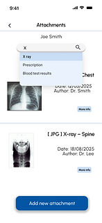
Added a quick “Add Attachment” button in the attachments section.


Adjusted text color for better contrast and readability.
Login Screen

High Fidelity Design
After conducting a usability test, I refined the high-fidelity design to address key usability issues and improve user flow. The final prototype reflects clearer navigation, better visual hierarchy, and smoother interactions based on user feedback.
“Having trouble logging in?” directs them to technical support.
Main Dashboard

Shows shortcuts to the most frequently used functions for quick access.
Patient Profile

Organized access to all patient-related functions.
New Attachment

Allows users to quickly upload a new document.
Main Dashboard

Prioritized notifications with color-coded hierarchy.
Hamburger Menu

Icons highlight functions, supported by text labels.
Patient Records

List of patients with filter options
Patient Records– Search

Users can search by name to quickly locate a patient from the list.
Attachment Detail

User can view the document and add a note.
Attachments

Users can quickly find files using the search bar.
Notifications

Prioritized by importance, users can view and access each notification.
Desktop Version
The mobile app was designed for busy nurses and doctors who need quick access to essential information on the go. The desktop version, however, is made for professionals working from a computer offering extended features like analytics.


Information Architecture
The IA defines the structure and navigation of the desktop system, ensuring a clear hierarchy between core sections such as Dashboard, Patients, Calendar, Reports, and Analytics.
Wireframes
Low-fidelity wireframes helped establish the main layout and content flow of the desktop dashboard, focusing on accessibility and efficient information overview.


High-Fidelity Design
The final design combines a clean interface with data visualization tools and smart shortcuts, allowing healthcare professionals to monitor performance, manage schedules, and access patient details seamlessly.

Main screen
highlights the most important notifications and key analytics, with a clear hierarchy and shortcuts similar to the mobile app for quick access to all features.

Patient List
Displays all patients with their current health status, making it easy to track conditions at a glance and prioritize care efficiently.

Weekly Calendar
Shows a week view of appointments and tasks, allowing users to quickly add, edit, and manage schedules in one place.

Yearly Calendar
Provides an overview of all months, helping users plan long-term schedules and track important dates at a glance.
Challenges
Designing an interface that allows medical staff to work efficiently under pressure.
Presenting critical information clearly while maintaining a clean, distraction-free layout.
Supporting different workflows and priorities across staff roles.
Lessons Learned
Simplifying key interactions, like adding attachments, improves efficiency and reduces friction
Clear hierarchy and spacing help users stay focused and complete tasks faster.
Consistent design patterns make the interface more intuitive and easier to develop.
